Reality Layer Zero
Development Notes #9 | What's Coming Up Next
Hello, this is Garrett Thompson, sole member of Act-Novel. It's been a little over two months since the Second Layer update came out, so it's due time for an update regarding what's coming up next for the project. There are a variety of categories I'd like to bring attention to today, so get ready!
Hotfix 0.3.2.1.1
First, some notes on the recent update: about a week ago, I uploaded a hotfix to address some of the slowdown issues at the end of the Second Layer that many players reported. I'm not entirely certain this hotfix completely fixes the slowdown for all players-- since that's likely hardware-dependent-- but most should see at least some improvement in the climactic debate of the Second Layer.
Planned Gameplay Improvements
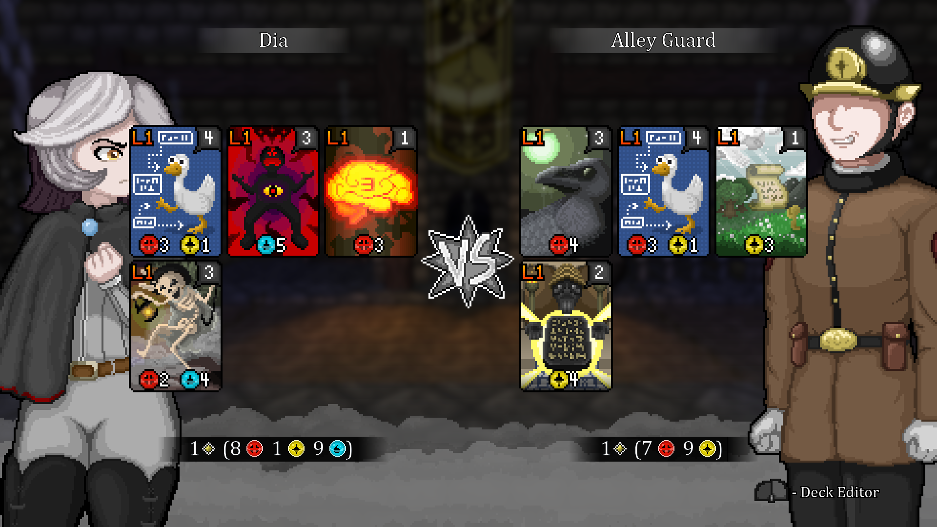
In a previous development notes entry, I wrote about several adjustments made to the core debating gameplay for the Second Layer update. Two months after release, I'm fairly confident in stating that these adjustments did make for a small improvement to overall gameplay pacing, but I'm still receiving some indication that I didn't go far enough-- particularly, that some players are still getting their rotation stuck on unwieldy, difficult-to-resonate arguments.
To address this issue, I'm planning on doing a slightly-more-significant refactor of the debating system that will no longer require "accepted" premises to resonate an argument. In the updated system, you'll be able to resonate any argument you can pay for, whether with fresh or accepted premises. The wrinkle, however, is that arguments paid for with fresh premises will be weaker than arguments paid for with accepted premises-- or, more specifically, that an argument's strength will attenuate when fewer of its required premises are accepted. That might still be a bit difficult to comprehend, so here's an example.
Suppose you have an argument that costs 3 Logos, and has a maximum weight of 5 (i.e. worth 5 points when resonated). In that instance, observe the following relationship between premises and argument value.
- When the player has fewer than 3 Logos on the field, the argument cannot be resonated.
- When the player has 3 Fresh and 0 Accepted Logos on the field, the argument *can* be resonated for an attenuated value of 0 points.
- When the player has (greater than or equal to) 2 Fresh and (only) 1 Accepted Logos on the field, the argument can be resonated for 1 point.
- When the player has (greater than or equal to) 1 Fresh and (only) 2 Accepted Logos on the field, the argument can be resonated for 2 points.
- When the player has 3 or more Accepted Logos on the field, the argument can be resonated for the maximum 5 points.
As the player escorts more and more Logos into the "accepted" column, the argument becomes stronger, until it reaches maximum strength when the number of accepted premises on the field is equal to its cost.
This change introduces an element of risk and reward to the decision of whether to "score" your current argument. Do you take a guaranteed shot at a lower-than-optimal points value? Or do you take the risk of waiting an additional turn for a potentially even stronger argument?
Additionally, the option to trivially resonate with fresh premises will likely prevent situations where a player's rotation gets "stuck" on a single card.
Additional effects will not be influenced by argument attenuation, which should make more-strongly "utility"-oriented arguments (like Probatio Diabolica) more useful.
An intermediate update with this change (and others discussed in this post) will likely come out sometime between now and the release of the next act. Look forward to that, I suppose!
Writing Adjustments
Several players have expressed a level of discontentedness with how the "mystery" of the Second Layer unfolds. I think they're right, and that I may have written certain passages assuming that the twists were a little bit more twisty than they actually are. This is, I believe, to the detriment of how some characters and events of the second layer were received, which I'm admittedly a bit disappointed by.
Thus, to address these complaints, as well as to tighten up the script a little bit, I'm planning minor edits to a small collection of scenes from the Second Layer. None of the major events will change, so if you've already finished the Second Layer, don't worry about having to go in to replay it. I'm primarily focused on reducing the amount of time (and words) dedicated to discussing possibilities-- enough players have assured me those discussions are mostly superfluous that I feel compelled to edit them down for the sake of pacing.
In that same vein, I'm also considering a few subtle adjustments to characterization for some of the supporting cast-- but, again, nothing so extreme that it would require a second playthrough.
I'm also aware that some of these discussions dovetail with more broad philosophical concepts explored in the story. I don't mean to do away with them entirely! I just want to abbreviate them a bit, to reduce that feeling of frustration you get when you've figured the puzzle out but everyone else seems to be pretending that you haven't yet!
These adjustments will likely arrive alongside the gameplay improvements described above-- at some point between now and the release of the next act!
Character Art Adjustments
While this isn't necessarily high-priority work, something small-but-important about the character art as-is has been gnawing at me for a fair length of time. Specifically, the proportions: currently, most characters in Reality Layer Zero are drawn at between 5.5 and 6.5 heads tall. These proportions are a bit off from the "realistic" academic standard of 7.5 heads, and more than that from the artistic standard of 8 heads, and thus are actually a bit "cartoony". You don't usually notice this because, in most cutscenes, the character artwork is only ever seen from the waist-up, but there are the odd moment of near full-body exposure-- notably in the debate preview screens-- where the proportions are more explicated.
Here, I feel like the characters look a bit "stubby"-- which is, of course, fine! Art styles are these freeform, magical things that don't need to adhere strictly to reality one whit if nobody wants them to!
... The thing is, though, I... kind of... do want them to... A little bit... Mostly because Reality Layer Zero is actually a bit dark and serious at moments, and I think the cartoon proportions might be a little bit mismatched when it goes to those places, tonally.
... Also, it's been a couple of years since I first drew a lot of these characters, so I kind of want to take a second crack at rendering them, now that I'm a bit more experienced!
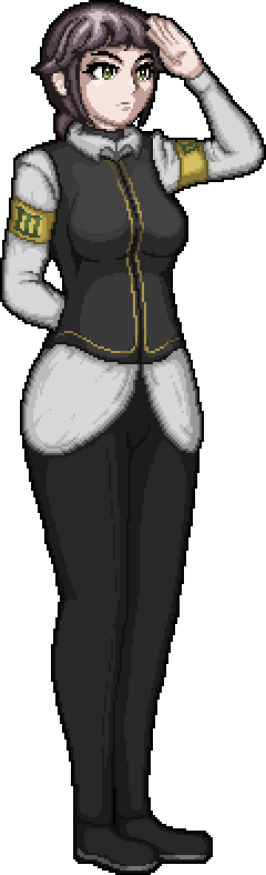
I was a little bit burned out on doing things strictly related to "development" after the second layer came out, so I took a little bit of time to just experiment, in a freeform manner, with more realistic proportions on the character art. I don't dislike the results at all! Here's the player character, rendered with more realistic proportions (as well as some added detailing).
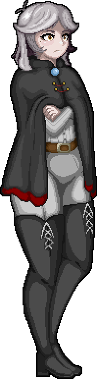
(Note that, because this is still prerelease, this may not be the final sprite)
And here's a comparison with the old proportions:
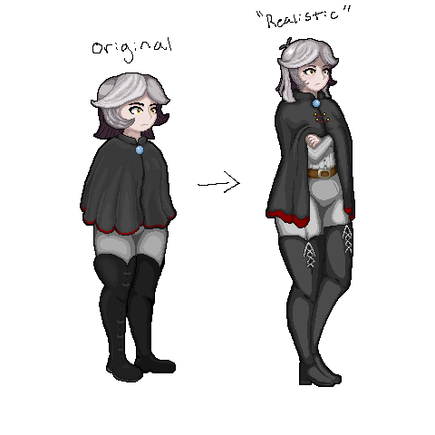
... You may be able to see what I'm talking about with regard to "stubbiness", here.
In-game, these proportions look something like the following (featuring classical Latin placeholder text!):
Still getting a feel for things. The offset of the stem on the speech bubble, for instance, could probably be moved-in closer to the art, here. Overall, though, I'd say it's not looking too shabby!
Note that the adjustments made to the player character's sprites are probably on the more extreme end of what I'm going for. Some characters may see only minor adjustments.
(Lucia Trattoria, drawn adhering to a more-realistic proportional standard)
Others (like the guard sprite in the GIF up above) may be effectively unchanged from their original incarnation. I know many people have expressed a fondness for the existing art style, so in making these adjustments, I'm consciously trying to stay true to that style while also bringing it more in-line with my concept for how it "ought" to look. In an ideal scenario, these sprites look just how you remember them, or otherwise, better!
... Of course, it's far from a settled matter. I'm about halfway through redrawing all of the character sprites in this style at the moment. If you guys, like, suuuuper hate this change, let me know. I'm not above scrapping completed work!
... However, if you consider this a lateral-to-positive move, I might gently suggest that we continue on this path, since there are some additional advantages I can think of that continuing this art adjustment project might beget. That actually brings us to the next section...
Promotional Efforts (Ugh!)
A number of you guys have mentioned that this was a difficult game to find out about-- that's partially on me, sorry about that! I have a general aversion to-- almost a phobia of-- promoting my projects, since I'm not very practiced at dealing with increased attention and/or scrutiny.
However, as I continue working on this project, it does become somewhat apparent to me that I really should start trying to get the word out about it in earnest. To that end, I'm really gonna try to gird myself to adversity and share this thing around the internet.
(The art adjustment thing I mentioned above might benefit this effort, since it's potentially a source of a lot of promotional materials that are easy to share around online)
I'm mentioning this here because this is actually something you can help with, to a certain extent! Reality Layer Zero has various accounts that you can follow, to trick an assortment of algorithms into showing this project to more people! I'm aware that certain websites aren't what they used to be, and the future of how things are shared on the internet is kind of in a weird intermezzo state at the moment-- but, we play the hand we're dealt, so please, follow along on whatever websites you can tolerate!
itch.io (aw yeah, this is a good one!)
If you haven't, adding the game to your wishlist on Steam would also be incredibly helpful!
I have a personal Twitter account... But I don't really use it.
I also have a Bluesky account... Which I've used even less! In case, uh, any of you guys are on... Bluesky...
... That's pretty much everything for now.
Wrapping Up...
In the interest of transparency, I haven't exactly, uh, "started" working on the next act yet! (heh heh...) I know it's been a little while, but I pretty much took the entire month of July off, for sanity preservation reasons. I'm getting back into things, now, though, and I expect development on main story content to resume as soon as all of the work discussed in this post has wrapped up. I'd give a rough timeline, but I did that a lot during the development of the Second Layer, and that ended up taking way longer than it had any right to! Suffice to say, I've since learned my lesson, yes sir!
Here's some additional odds-and-ends I intend on tackling by then, just for the sake of completeness.
- Second Layer "end of act" fullscreen illustration.
- Shadowless point lights (for scene composition)
- Externalized font settings (for ~extremely hypothetical~ localization purposes)
... I may have forgotten something, but that'll do for now!
Thanks for reading.
Comments
Log in with itch.io to leave a comment.
I think the changes are pretty good, but please keep old versions of game somewhere for download, nostalgia... :))
Debate Changes
I am GREATLY in favor of the debate changes. This will add a lot more options to each encounter. Good fix!
Hopefully we get to see Arguments that double combat speed too (I don't believe one exists yet?).
Sprite Changes
I like the new proportions! Some one else mentioned that they make Dia look older, which I agree with, but not with her being 40. She looks more like 20's now. It works for me.
The GIF demonstration sells me on the new proportions. It looks natural.
Although, I'm not a fan of the way the cloth folds over her breast when Dia is in the thinking pose. It looks like the cloth is tucked under when it should just drape in front.
Otherwise, looks good!
👍 nice changes 👍
Honestly the new sprites aren't bad, and the improvement is very visible (in the same way the sprites in Layer 2 were to layer 1 even without the proportions change). The way Dia's face is drawn make her look a lot older, I always assumed she was maybe a bit older than Adventure Kid. Basically I thought she was 16 with anime colored white hair, but now she looks in her mid 40 with white hair due to old age.
My biggest issue with the change is how the overall pixel density is affected. The previous character sprites and the cards were on a similar level of details, but now the portraits look more dense. Basically you have the overworld sprite (Chibi), the cards and the portraits each on a different level of detail whereas the previous character sprites looked more in line with the cards, and the proportions reflected the way the overworld sprite look so everything was more cohesive.
I don't think the proportion change is actually the issue, as the guard doesn't look weird at all to me. I believe it's the way you shade the hair with a lot of small lines instead of bigger masses of colors, and some of the details like the stray hair. If you take the character sprites in a vaccuum, the faces are more pixel dense than the rest of the body. Perhaps the guard isn't as dissonant because he's got no face details at all.